

Faber & Faber
1941
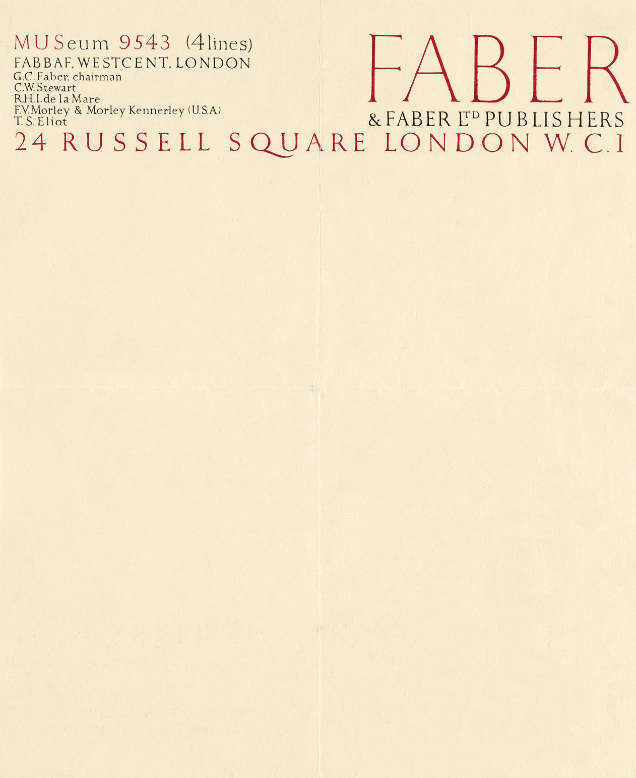
A superb 1941 letterhead from esteemed publishing house Faber & Faber, distinguished by its elegant typographic design—T. S. Eliot’s name a reminder of his role both as a towering poet and as a literary editor who helped shape the century’s most significant voices.
Source: Swann Galleries
Another beauty. Although I wonder why the right leg of the R in the large red FABER (top right) extends past the two lines of type below. Any thoughts?
Still contemporary.